How to design a super slick UI button in Photoshop
Buttons, buttons, buttons. We've all seen these little fellas. There's probably loads sitting write at your finger tips this instance (unless your using a touchy screen, check you)! They're an integral part of the user experience so I'm going to walk you through how to create a super slick UI button in Photoshop so you can add some awesome-ness into your UI. Your users' will love you muchly.
What you're going to need (or something similar)
- Photoshop (for precise pixel graphics)
- Illustrator (creating perfect shapes, PS will do this too though if Illustrator is the bane of you)
- A keen eye for pixels and colour
Right, let's begin in Photoshop, create a new document at least 500x500 and make sure the DPI is 72.
Create a background to work on
First we need a background to place our button on. Unlock your background layer and fill it with your colour of choice (I'm using a dark (#575757) colour). Next I'm going to create a matte effect by applying some subtle Noise (Filter > Noise > Add Noise) with the following settings Amount: 0.8%, Distribution: Gaussian, Monochromatic: Yes. Adding this matte effect gives it a 'real world texture', making it appear more realistic.
Important: Remember to keep the noise to a minimum (bet you're sick of hearing that), don't blind your users with thousands of pixels, just ease it in gently so it's just noticeable.

Now hop into Illustrator or try the next step in Photoshop if you feel more comfortable.
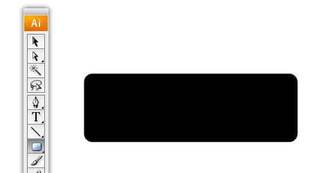
The button shape
Most buttons you see around you are square, but not dead square. They will have small rounded corners which are ever so pleasing to the eye and this is what we want to achieve.
Select the Rounded Rectangle tool (make sure your stroke is turned off and your fill colour is black), click your canvas and enter the following options: Width: 100px, Height: 32px, Corner Radius: 4px. This will create a nice button with a small (but still noticeable) curved corners. Voila, our base of the button.
We need two other shapes though (do these in different colours), one two pixels bigger, the other two pixels smaller. The one that's two pixels smaller will sit on top of our base shape, the larger one will lay underneath. Keep the Corner Radius's the same though.
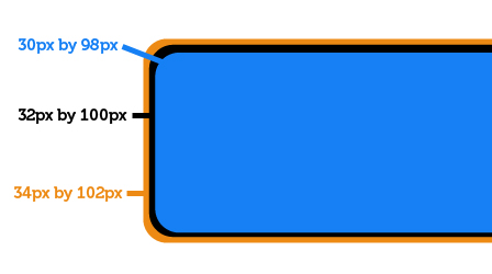
Copy each shape and assemble them in Photoshop with the appropriate layer positions. Our base shape will be the base layer, below that (the orange shape) the outer stroke and finally the blue shape will go above all of 'em, call this the inner stroke.
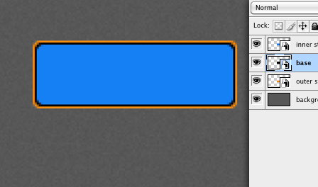
Base layer
All the colours of our button will be based around our background colour and the base layer. So hide the inner stroke and outer stroke layers so we can focus on the base layer.
Lets start with a Gradient Overlay (double click the layer in the layers palette to bring up the layer styles) that's darker than the background. Dark (#444444) at the bottom to light (#555555) at the top.

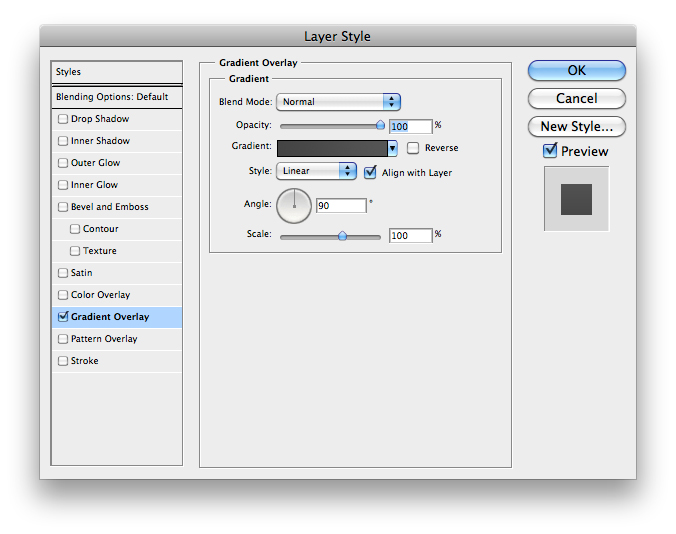
We need to now create a defined edge between the background and our button. Do this by adding an 1px inner Stroke that is dark (#313131) at the bottom and light (#414141) at the top. This gives the button a sharp crisp edge and stops it looking all fuzzy.


Inner stroke layer
The inner stroke layer will be used to add a strong highlight to the inside of our button, giving the user the impression it's sticking out of the page - wanting to be pushed!
Reveal the inner stroke layer and CMD+Click on the layer thumbnail to highlight everything inside and contract the selection by one pixel (Select > Modify > Contract).

Now hide the selection using a layer mask (Layer > Layer Mask > Hide Selection), this should leave you with a one pixel stroke.
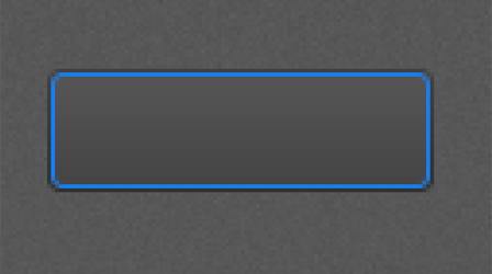
Shiney time! Add a Gradient Overlay to the layer going from Dark at the bottom to light at the top. The bottom colour must still be lighter than the colour behind it though, keep this quite subtle. The colour at the top needs to be a bit brighter to give it that shine.


Remember when you're working this zoomed in (600%), always zoom back out to 100% to see if the colours are working well together and the highlights/shadows are looking as they should. Here's what you should have so far:
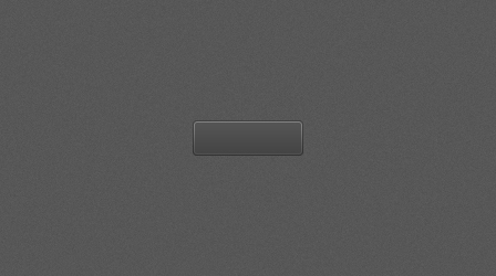
Outer stroke
Now to make the button seem as though it is embedded into the page and not just floating around. Make the outer stroke layer visible and add a Gradient Overlay to it. What were trying to do is create a lip at the bottom. So the top of the stroke must blend in with the background, where as the bottom will be a lot brighter, making the button seem deeper. I used #555555 at the top and #7c7c7c at the bottom.


Add some de-bossed text
Of course our button as to say something. So pick your favourite type face that is fairly weighty (not too thin) and add some light grey text. I'm using Georgia Italic at 14px #8e8e8e.
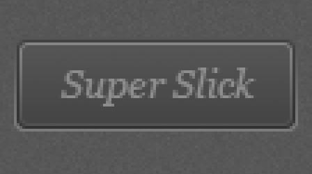
To give it that de-bossed look it needs a shadow at the top to give the impression that it's the sunken edge. Duplicate your text layer (make sure it's underneath the current one), nudge it up one pixel and give it a darker grey colour. Remember we're trying to keep this subtle, so don't go giving it a harsh black. The second colour I've used it #333333.
Here it is at 100%.

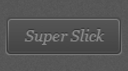
Adjusting the outer stroke
At the moment the outer stroke layer is looking a little harsh. I think it'd be better if the gradient started closer to the bottom edge of the button. Adjust the position of your darker colour to about 25% giving the button a sharper edge. That's better!
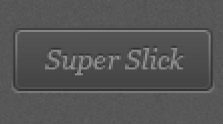

And here we have our final button!

21 comments
Photoshop Tutorials Blog wrote on
Great tutorial. I also linked it from my blog! (=
Ostap wrote on
Very cool!
I love button like this!
Callum Chapman wrote on
Great tutorial and lovely outcome. I’ve tweeted, facebooked, stumbled and bookmarked!
Richie wrote on
Wow… Super Slick indeed. Great Tutorial, Ben
donkeyneto wrote on
all its about pixels… nice look
Bassam Qalawi wrote on
Supper Slick I like it ….
Carson Shold wrote on
Great post. I always see such nice buttons but never get the details of how they get that way, so it’s nice to see the process.
Cheers
Glenn Van Bogaert wrote on
Great outcome and post. Really love the detailed lines. Oh, and a great tip about using the noise effect.
Ydapad wrote on
Ps. Very Cool , I like
Afam wrote on
This is so beautiful. Thanks for the tutorial.
Chirahan wrote on
I have a homework to make buttons I am sooo happy could make it, thank you thank you thank you :))
Pingback: Buttons in Photoshop | Photoshop tutorials for every photoshop user
Web Design Stoke wrote on
It’s the best time to make a few plans for the long run and it is time to be happy. I have learn this publish and if I could I wish to suggest you few fascinating issues or suggestions. Maybe you could write subsequent articles referring to this article. I desire to read even more things about it!
Pingback: LeoMoon Studios|Graphic|Animation|Maya|Blender|Adobe|Short Film
cahbreis wrote on
Excellent tutorial.
Pingback: Create A Button for your Website using Photoshop Tutorials
Kambakht_Bugz wrote on
Awesum n simple
Eva wrote on
Write more, thats all I have to say. Literally, it seems as though you relied
on the video to make your point. You definitely know what youre talking about, why waste your
intelligence on just posting videos to your weblog when you could be
giving us something enlightening to read?
general wrote on
You really make it seem so easy with your presentation but I find this topic to be actually something
which I think I would never understand. It seems too complicated and extremely broad for me.
I’m looking forward for your next post, I will try to get the hang of it!
general
Ben wrote on
Nice tutorial. I like that you explained why you were performing each step. That way the reader can apply these steps to other projects.
Pingback: 45+ Photoshop Button Tutorials | WPRazzi